Designing a lightweight social fashion experience from the ground up
Overview
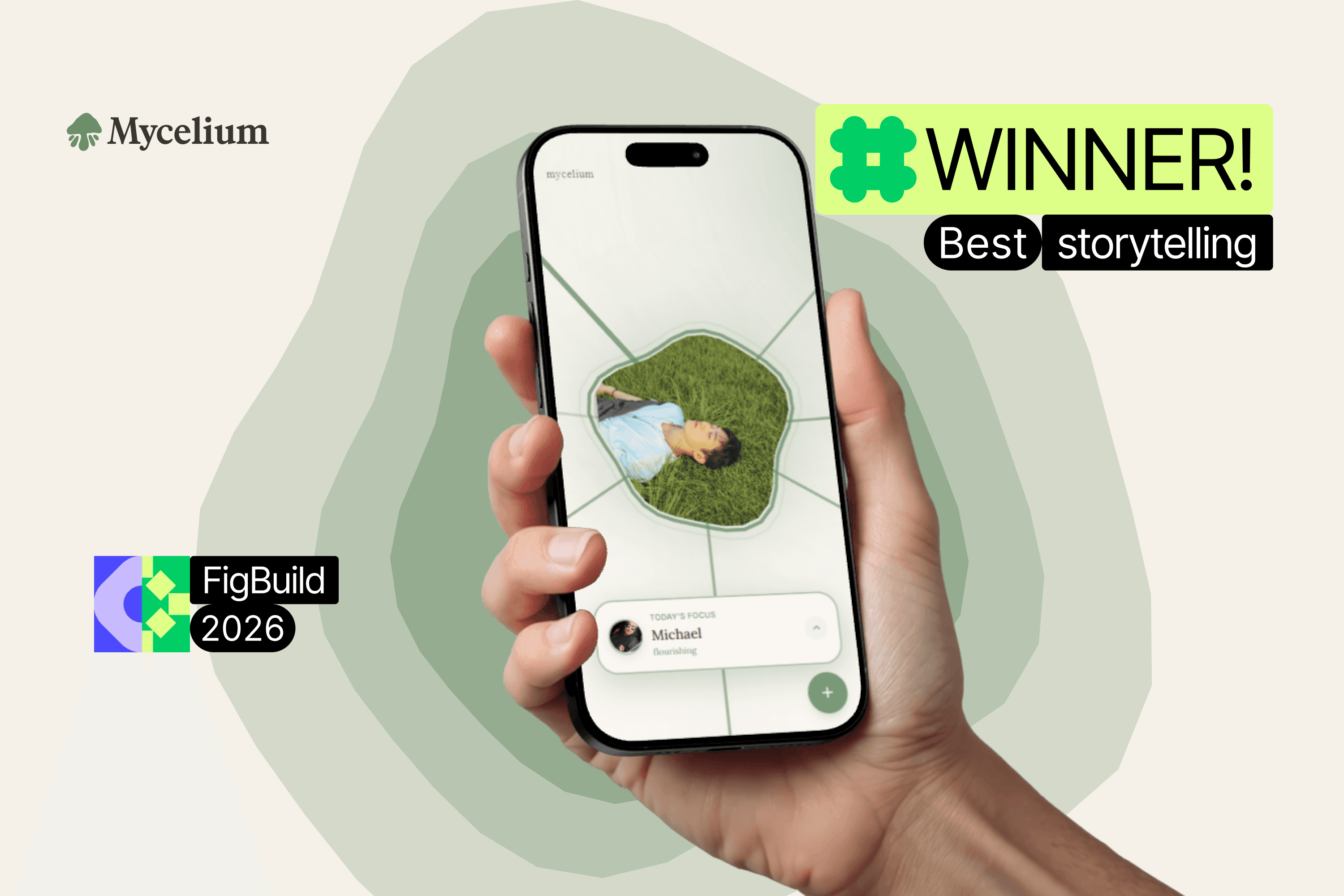
OOTD is a social fashion app where users share their outfit of the day and engage with friends through likes, comments, and daily challenges. As the Lead Designer, I owned the product design end-to-end — from UX flows and interaction design to visual identity and core feature design — while collaborating closely with developers to bring the product to life.

The Mission
Why outfit sharing needed its own space
Existing platforms like Instagram weren't built around the specific rhythm of daily outfit sharing. They were too broad, too performative, and too polished. OOTD was designed to fill that gap — a focused space where showing up daily is celebrated, and where community, not clout, is the point.


Our Research
What makes daily content apps actually stick?
The process began with lightweight competitive analysis of platforms like BeReal, Tinder, and Instagram — examining how users engage with daily content, swipe-based interactions, and community-driven feedback loops. These insights directly shaped OOTD's core interaction patterns and onboarding flow.

Design Approach
Building for fun, familiarity, and community!
The design direction focused on approachability over aspiration. Every interactino was chosen to feel familiar yet fresh.

— User Flows
Our Process
We mapped out the infrastructure of how we wanted the app to be layed out


Insight One
How to evaluate a good outfit
Our initial idea was to have users vote on each outfit via swipe left or swipe right.
User Testing
Lets ask the audience
Though our discord community we interviewed some of our heavy and casual beta testers.
Was it clear what the app was for and how to use it after signing up/onboarding? If not, what was confusing?
What part of the app felt most intuitive or easy to use? What part felt the most confusing or frustrating?
Did you feel motivated to post, tag friends/locations, or interact with others? Why or why not?
How would you describe the app’s vibe or aesthetic to a friend? Did it feel aligned with your expectations?
What’s one thing you would change or improve right now to make the app better?

So we changed it up
We introduced a different but familiar rating system

How we tackled problems with 5 star ratings
New posts with less 5 rated votes can result in a star average compared to outfits with lots of 4 star ratings, but does that mean the newer post deserve that 5 stars?
We introduced a Bayesian average

Learnings